Terry app solution
Terry is an app to educate and inspire action for wildlife conservation, the users can learn about species, habitats, and threats while rewarding their contributions and connection with local organizations.
expertise
UX UI Designer
platform
Figma/Canva
team
Dora, Rafael and Laura
Background
In today's world, human expansion threatens many species. Conservationists and experts strive to raise awareness, but public attention is often lacking. Technology offers hope by empowering people to make a difference.
What we aim to do
Introducing an app to educate and inspire action for wildlife conservation, the users can learn about species, habitats, and threats while rewarding their contributions and connection with local organizations.
The Problem
Busy adults struggle to understand the importance of environmental conservational and wildlife preservation because they lack an easily, accessible and informative tool to educate themselves and understand the significance of their contributions and actions towards the environment.
The Solution
Our team created a sustainable habit tracker to inspire and engage busy adults by offering a visually informative tool. This will help educate them about the importance of their environmental contributions to conservation and wildlife preservation. By visualizing the impact of their actions, we aim to build a community of empowered individuals who feel motivated to make a difference and be part of the solution.
Research Methods
By conducting descriptive/exploratory research we gained insights into the defined problem to understand the target audience's needs and pain points.
Interviews were used as our primary qualitative research method.
Literature review and competitor analysis were used as our secondary methods for gathering quantitative data.
Interview
Based on the key findings from the secondary research, hypotheses for our potential target audience were created.
We then interviewed 7 participants and used abductive reasoning to understand and create insights.
Key Findings
Persona
Empathy Map
To understand our persona better, we created an empathy map.
Point of view (POV) Technique
Why do they want to visualize their contributions?
Because they want to see the significant impact their contributions will have in their own lives, they want to feel like they are part of the solution.
HMW Questions
Ideation
To generate a diverse set of solutions that cater to the pain points of our user group, we organized ideation sessions where we brainstormed and used mind mapping to explore various features. We used the method of Dot Voting to choose our solution.
Storyboarding
Conceptual Sketches
User Flow - Task Oriented
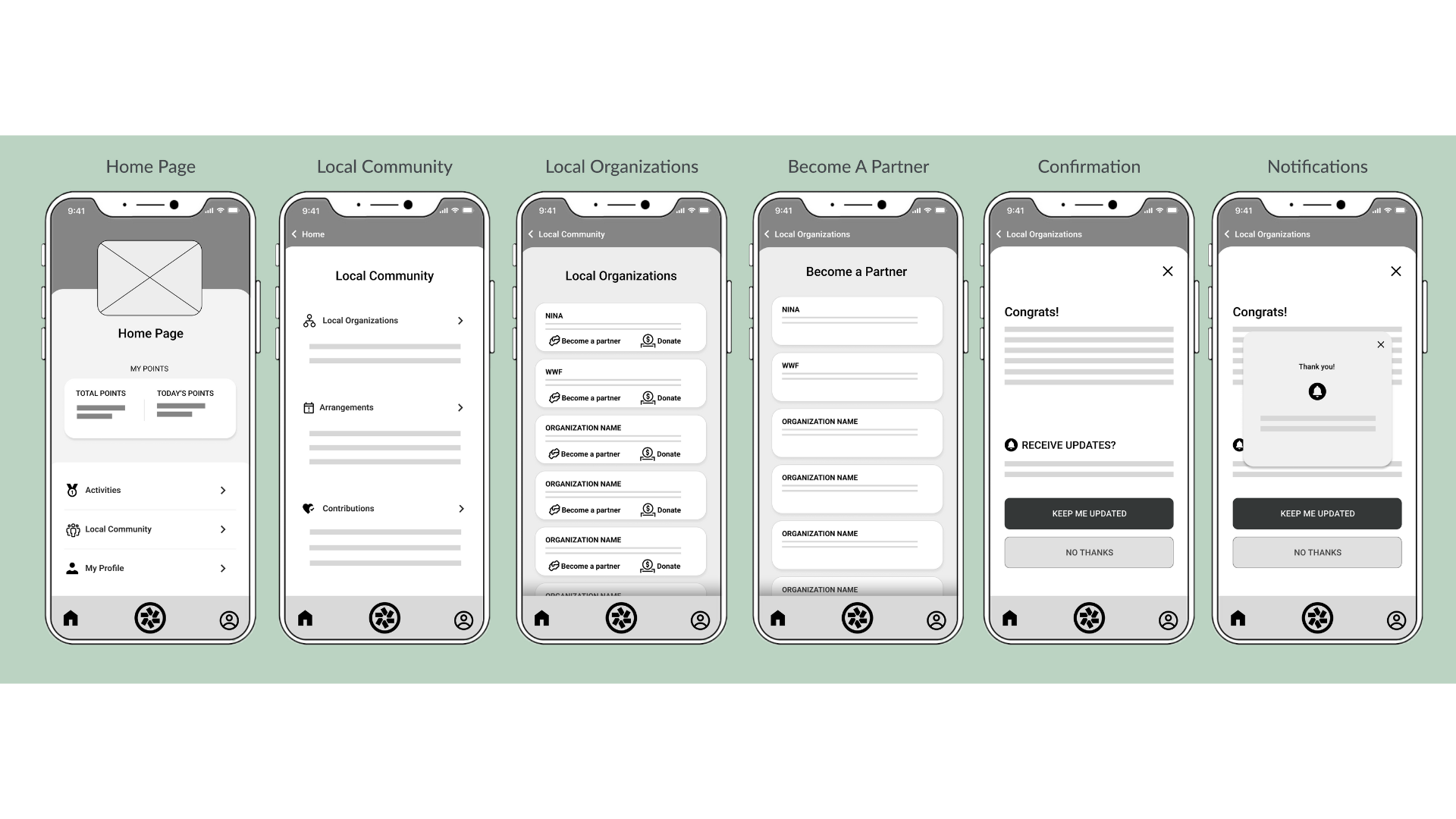
Low Fidelity Wireframes
Usability Testing
We conducted a remote moderated usability study to test the effectiveness of our low-fidelity prototype.
The goal of the study was to guide the design from wireframes to mockups, gather feedback on the usability of the prototype, and identify any areas for improvement. The primary insights we gained after synthesizing our data were:
Insight 1: Non-intuitive labels and navigation
The lack of intuitive icons and clear labeling leads to difficulties in navigating and understanding the system's functionality. The participants expressed the need for clarity in identifying goals, recognizing icons quickly, and understanding where to click for specific actions.
Insight 2: Difficulty finding activity
Users experience difficulties finding specific sections and activities, and understanding which category to select for certain actions. The unclear labeling and low-fidelity wireframes have contributed to the confusion.
Insight 3: Small buttons
The button size is an issue, as some participants struggle to click smaller buttons. In the case of the "partner with this organization" button, its small size made it challenging to interact with.
Insight 4: Usability test instructions
The test instructions contained excessive text, which caused distraction and impeded the smooth progress of the task. Participants reported difficulties in registering and retaining information, resulting in the need to frequently refer back to them for clarification.
Design Iterations based on feedback
Next Steps
Iterative testing: After implementing the changes based on usability testing, conducting further rounds of testing to validate the improvements would be one of the next steps. Iterative testing will allow us to uncover new issues and refine the app based on user feedback.
Improve the user interface (UI) design: Based on user feedback, the UI design is refined to make it more visually appealing, intuitive, and consistent. Improving the layout by adding typography, colors, and icons to ensure a cohesive and engaging user experience.
Continuous user feedback: Establish channels to gather ongoing user feedback, such as surveys, feedback forms, or user forums. Actively listen to user suggestions, identify recurring pain points, and prioritize enhancements based on user needs.
Refine user persona: We are refining our user persona based on the insights gained from usability testing and ongoing user feedback and ensuring that our app is designed to cater to our target audience's needs, preferences, and goals.
Final Screens
What I learned
User Expectations: Users have certain expectations regarding app usability, navigation, and overall user experience. We must align our app design and functionality with these expectations to ensure user satisfaction.
Clarity and Simplicity: Users appreciate clear and intuitive interfaces that are easy to understand and navigate. Simplifying complex tasks and ensuring that information is presented straightforwardly and concisely is crucial.
Although I have learned a lot, I know it’s important to remember that app development and improvement are iterative processes. I want to keep a continuous improvement mindset, stay connected with our users, and adapt our app based on their evolving needs and expectations.
Thank you for reading my case study!


